Burton Spring/Summer 2014 - Site Refresh
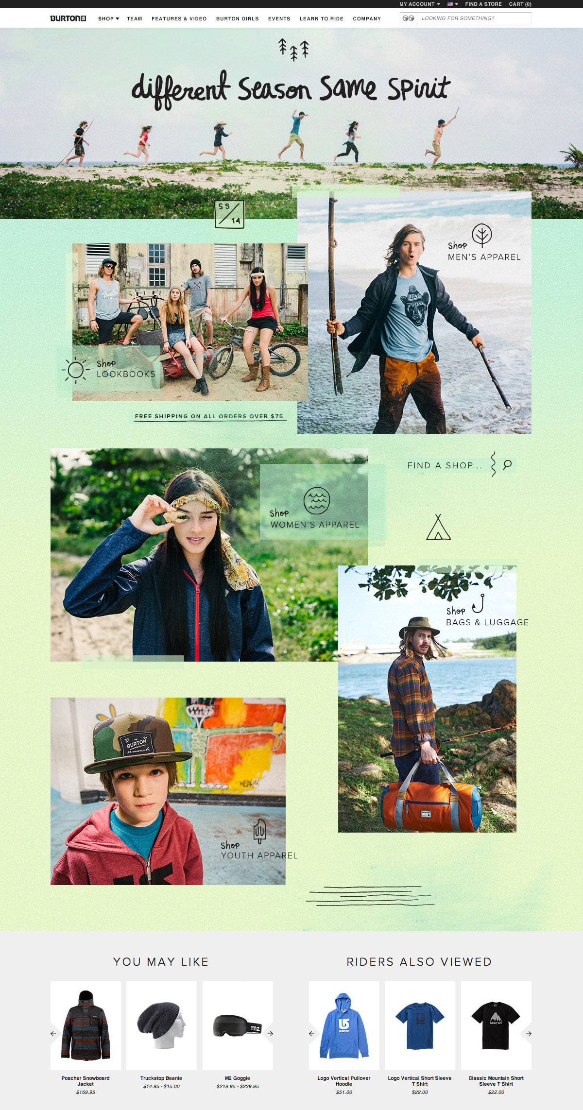
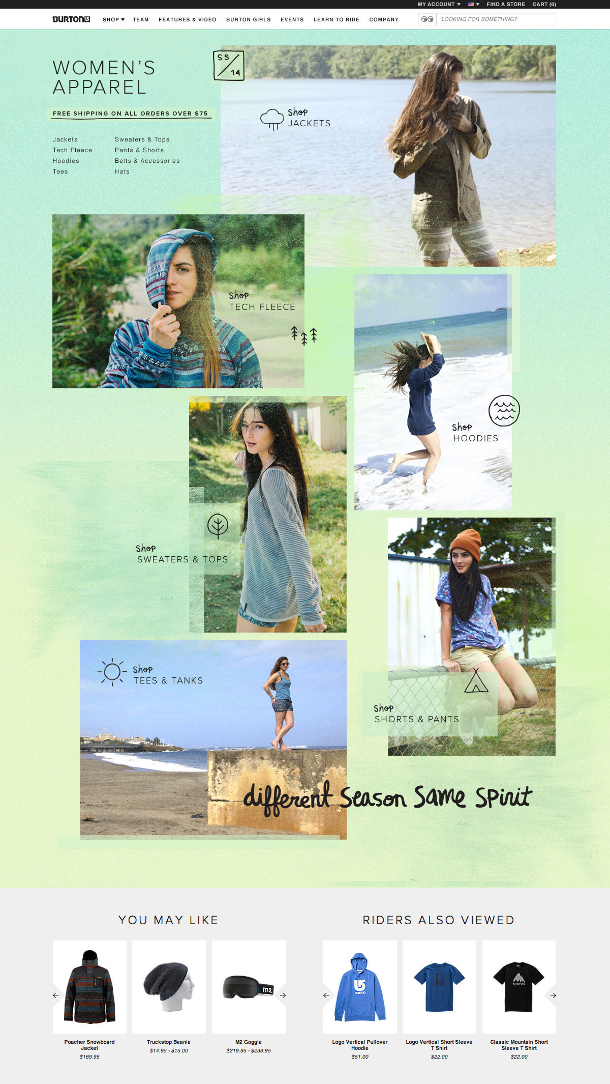
Burton Snowboards does the majority of it's business during the winter months, so pushing the spring/summer apparel & bags line has become a big initiative for the company. For the Spring of 2014, we took a look at the shop menu and overall architecture of site, and re-worked it to focus around the apparel and bags, putting all winter gear as a secondary message.
The product launch and marketed launch were a month apart. In February, the new product was loaded into the eCommerce store, and we promoted it with a loud 'new' callout in the menu. In March, we launched the full marketing campaign, and with that launch we revised the menu to feature apparel and bags front and center and moved all of the snowboarding gear to the end of the menu.
Here is a look at the plans for the menu and initial wireframes for the new apparel & bags pages.


The final design was rich with spring colors and textures. We experimented with subtle parallax scrolling on the apparel landing pages, rich with animating icons and a moving cinema-graph feature image. The spring/summer site was well received within the industry, and the best performing apparel & bags season to date.